When colouring in a full range of colours, it is still a useful tip to start by colouring the whole area with the palest shade you have. Then build up the shades and finish by using the palest shade to blend the colours. Alternatively you can buy a blending pen which can be used with any colour. You will need a few shades of each colour.
Useful Additions: It is useful to have a fine liner pen in black for detail. A white gel pen is also useful for adding highlights to your coloured image.
All supplied from Jill at Cardinal Colours
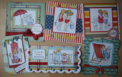
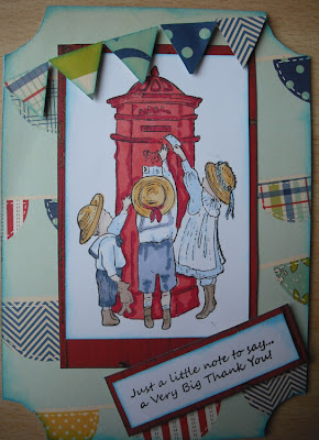
Papers - October Afternoon - Seaside Collection
Card Blanks, Card Candi and A4 Digital Smooth White Cardstock - Craftwork Cards
Pens - Promarkers - Pastel yellow, mustard, gold, sandstone, caramel, red, poppy, ruby, pale pink, dusky pink, ivory, powder blue, cornflower, china blue, sky blue, arctic blue and midnight blue.
Cardstock - Bazzill
Chalk inks - Colorbox
Tuxedo dye based ink pad - Memento
Stamps - by Joanna Sheen's All Our Yesterdays stamps designed by Faye Whittaker
Punches - Stampin' Up
Ribbon - Cardinal Colours
Washroom Teddy FW908
Lifebuoy FW901
Bucket and Spade FW912
Sandcastle FW911
Dolphin FW907
Postcard FW909
TFL




these are really really pretty too Lynn, but I think my faves are def the sepia tone ones. Your cards are always so very lovely..xxxx
ReplyDelete